catalyst

Catalyst Medtech sees a world where molded plastic buttons and radiation mapping are a means to compassionate care.
Pulling together the fragments
hen the new CEO stepped into leadership at TTG Imaging Solutions, he inherited 14 separate acquisitions operating without a cohesive identity or unified market positioning. The challenge was existential: how do you transform a collection of disparate nuclear medicine companies into a beloved market leader?
Purpose was found amidst the market’s flood of feature-function language, bland statistics, and equipment specs. Nobody was selling results. Competitors all focus on immediate buyer benefits without addressing the downstream value to humanity and sick people. This created both a market opportunity and an internal rallying moment for a company in need of differentiation and unity.

Creative Direction
Brand Identity
Messaging
Copywriting
Healthcare Technology
2025
Selling values, not value
Our first major insight cut straight to the heart of their sales challenge: we needed to sell values, not value. Connecting with doctors around their shared mission of helping people become healthy again forms longer-term relationships built on value alignment and shared motivation.
The rebrand needed to fundamentally shift them from an equipment supplier to a life-giving solutions partner who understood that behind every piece of molded plastic and buttons was a human story worth supporting.
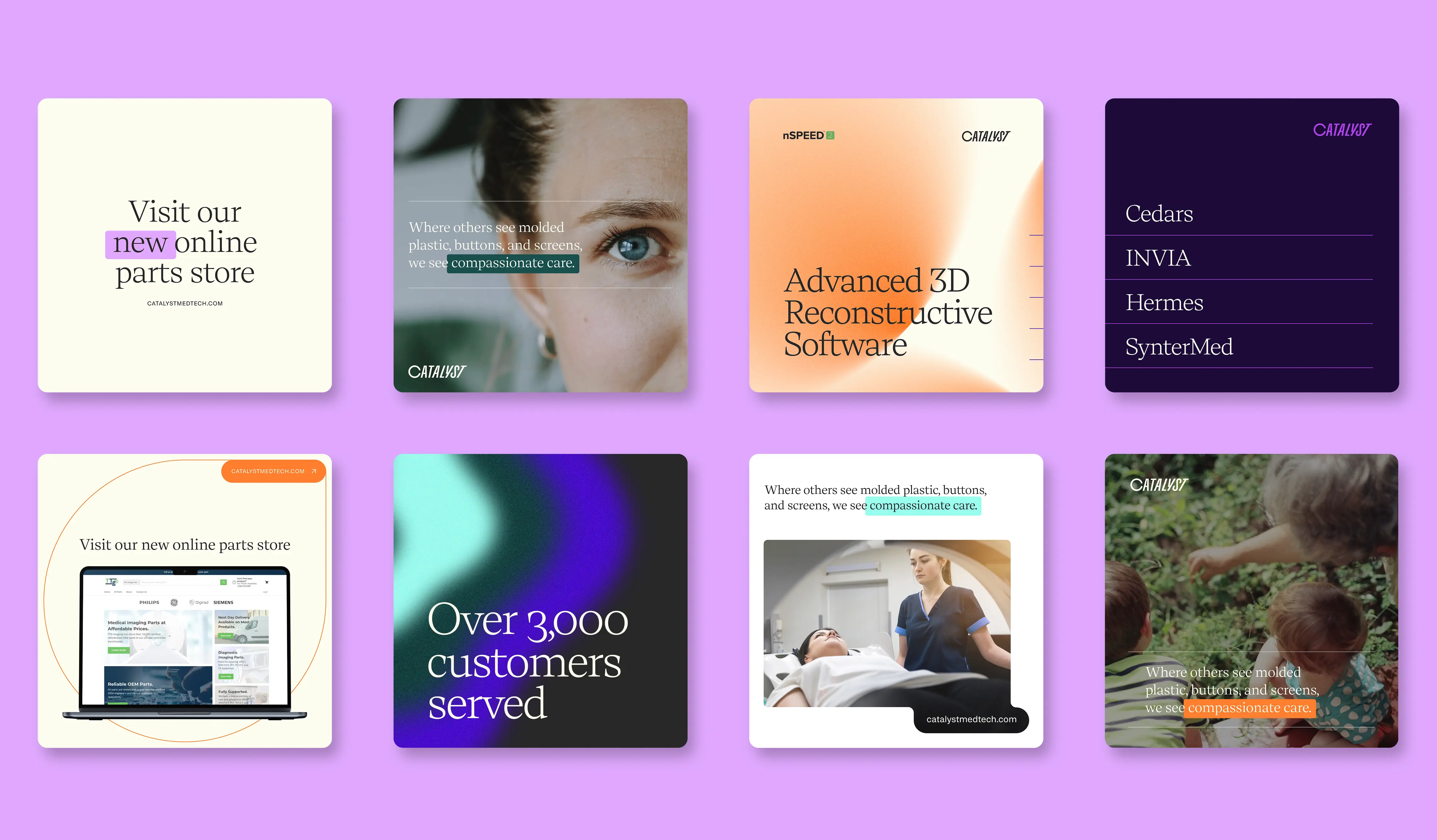
Making essential reactions possible
Our discovery revealed that they have unmatched end-to-end capabilities—original equipment manufacturing, FDA-standard refurbishing, nationwide service, and mobile imaging—that larger competitors couldn’t offer. What they lacked wasn’t capability, but a unifying story that connected it all to their purpose: saving lives. Enter Catalyst Medical—a name that brings scientific credibility, if not ubiquity—a challenge overcome through novel identity work. We broke from the industry's dry, low-energy, low-inspiration approach–embracing an aspirational view of their impact on the world. We helped them feel bigger while differentiating from competitors who focus solely on technical features.
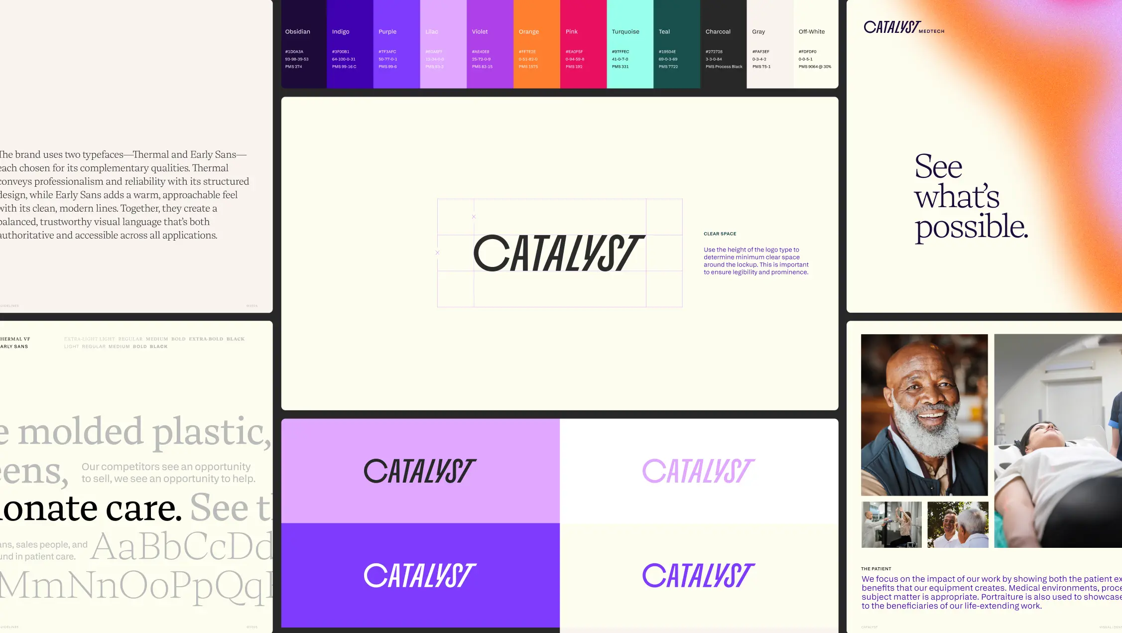
Where they zigged blue, we zagged purple
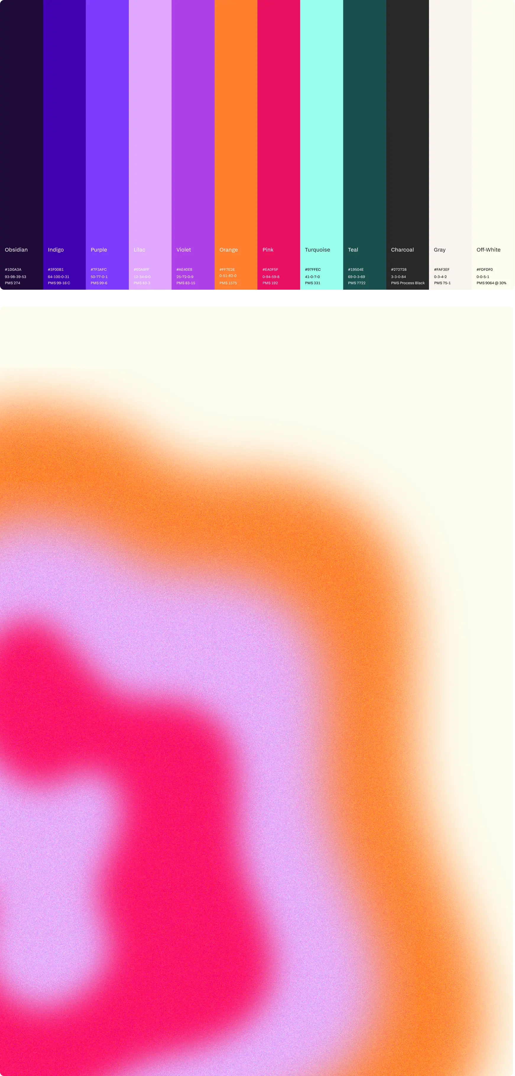
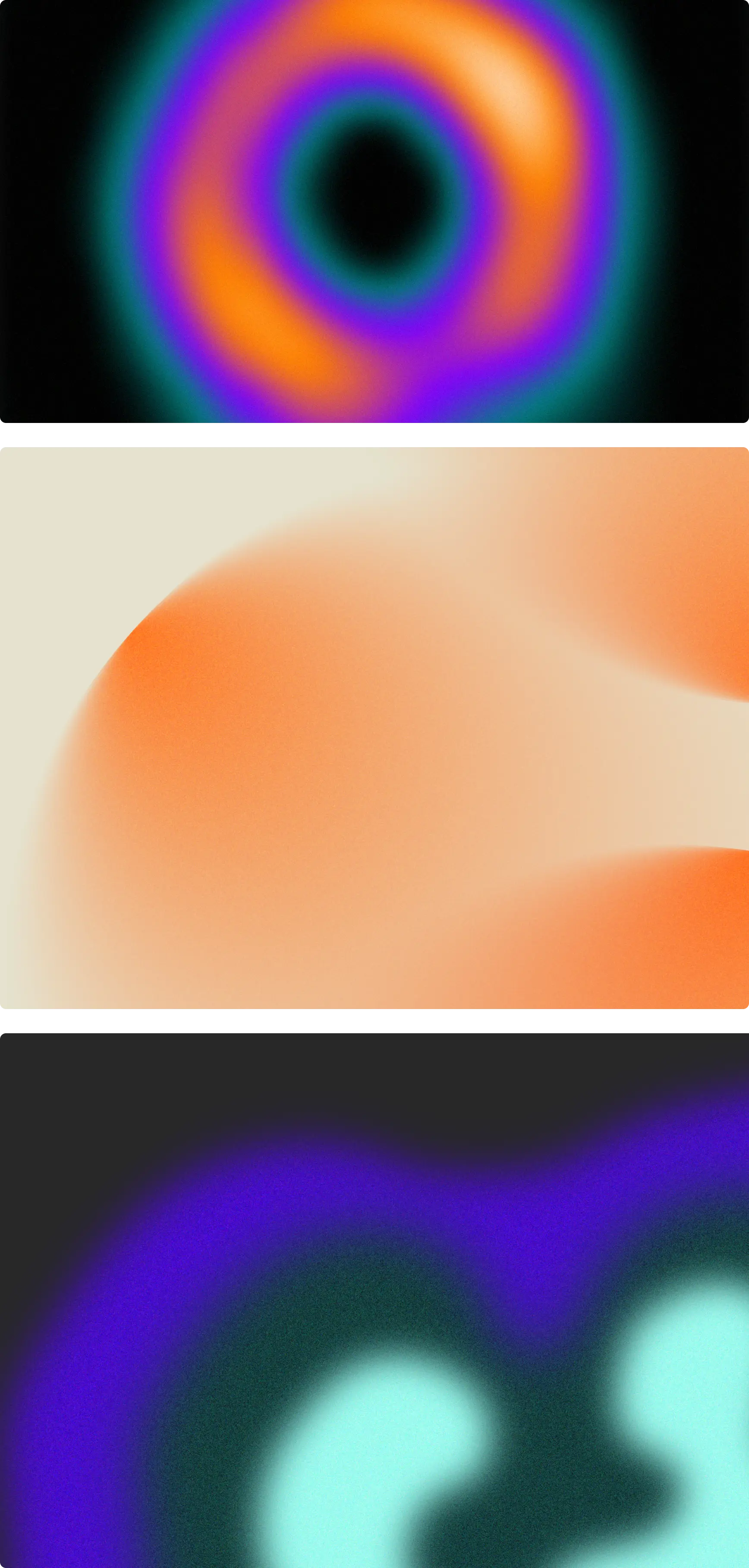
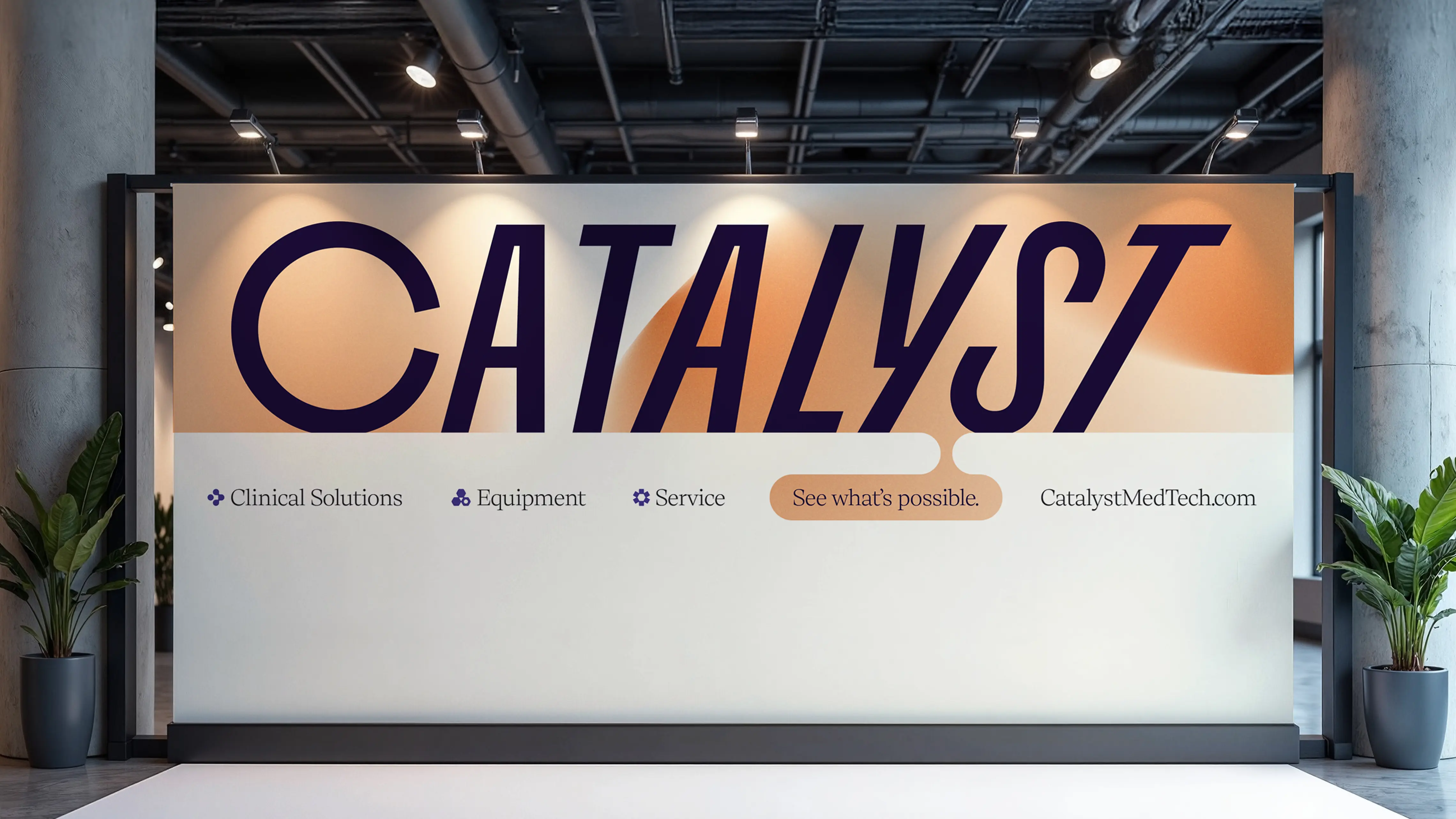
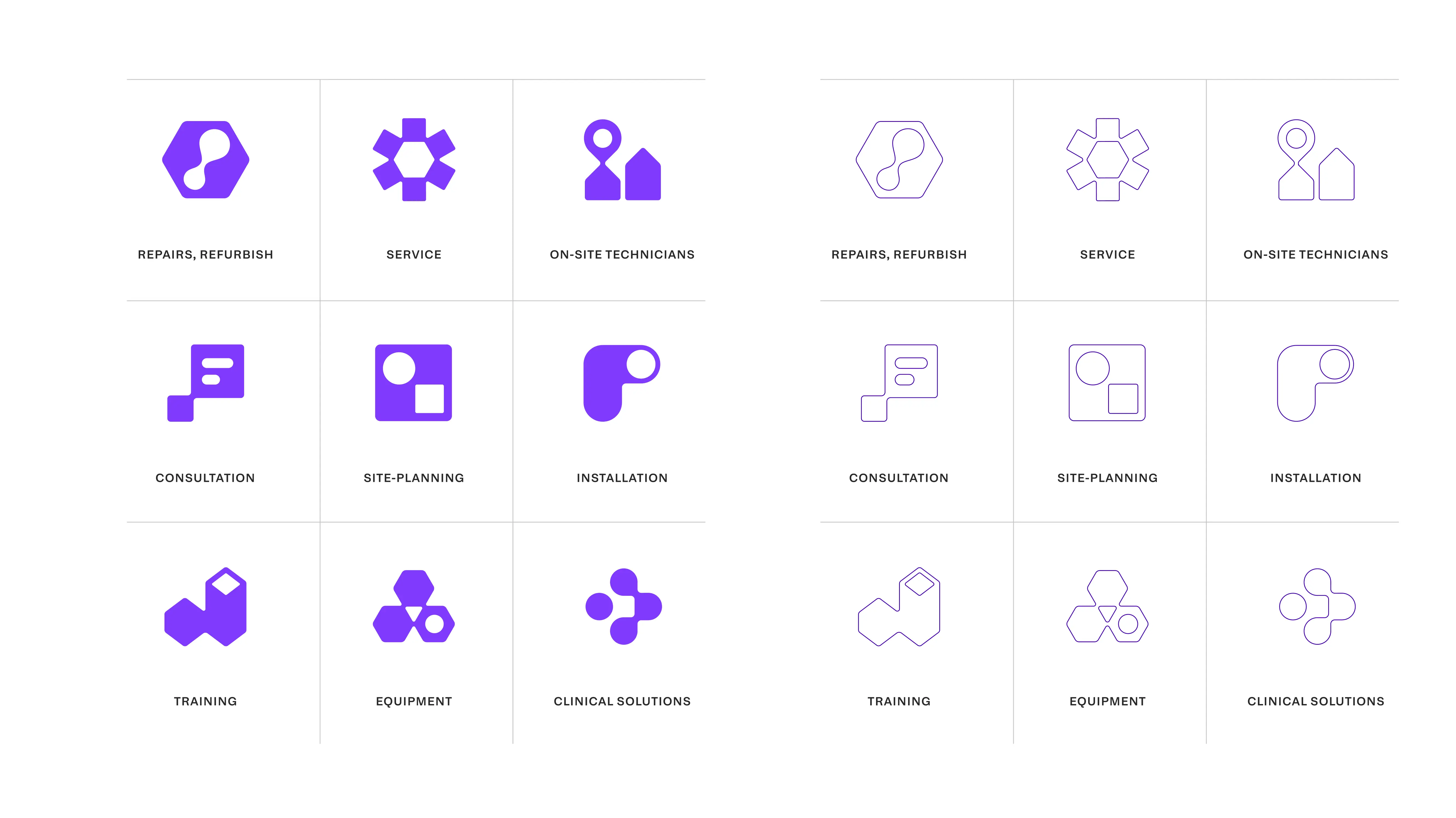
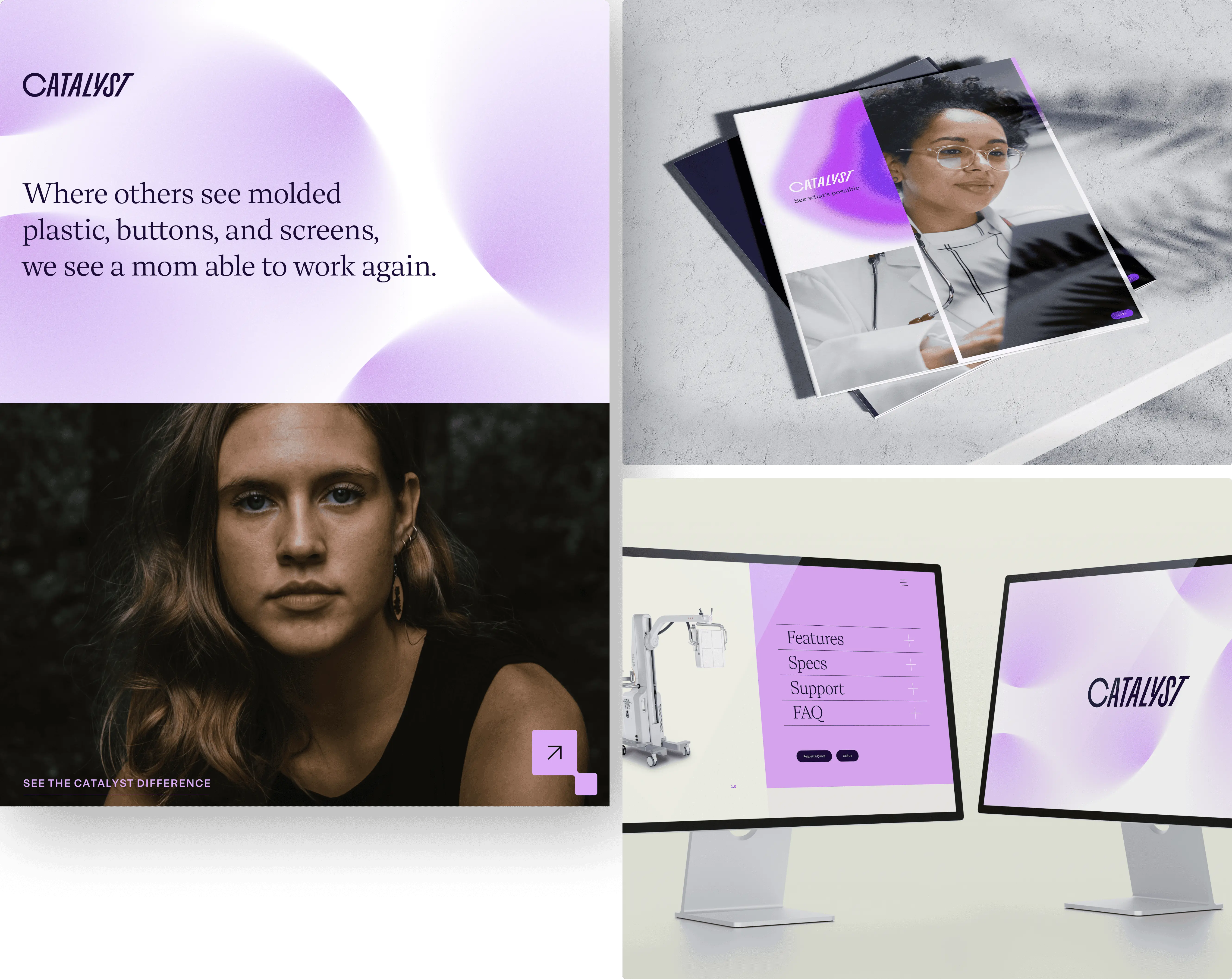
The visual identity balanced medical credibility, technological innovation, with energy while completely breaking from the corporate vibes that characterize medical equipment marketing. On one hand, the dynamic wordmark blatantly characterizes future progress and cutting-edge technology. Contrast this with a color system that reflects
the deeper values and softer attributes of life-saving care. Instead of predictable healthcare blues, we anchored in vibrant purples and oranges. Meanwhile, the typography straddles technology and human approachability by pairing Thermal and Early Sans. These create an expressive yet minimal foundation for the identity.
Connecting the brand to the experience
The visual identity balanced medical credibility, technological innovation, with energy while completely breaking from the corporate vibes that characterize medical equipment marketing. On one hand, the dynamic wordmark blatantly characterizes future progress and cutting-edge technology. Contrast this with a color system that reflects
the deeper values and softer attributes of life-saving care. Instead of predictable healthcare blues, we anchored in vibrant purples and oranges. Meanwhile, the typography straddles technology and human approachability by pairing Thermal and Early Sans. These create an expressive yet minimal foundation for the identity.